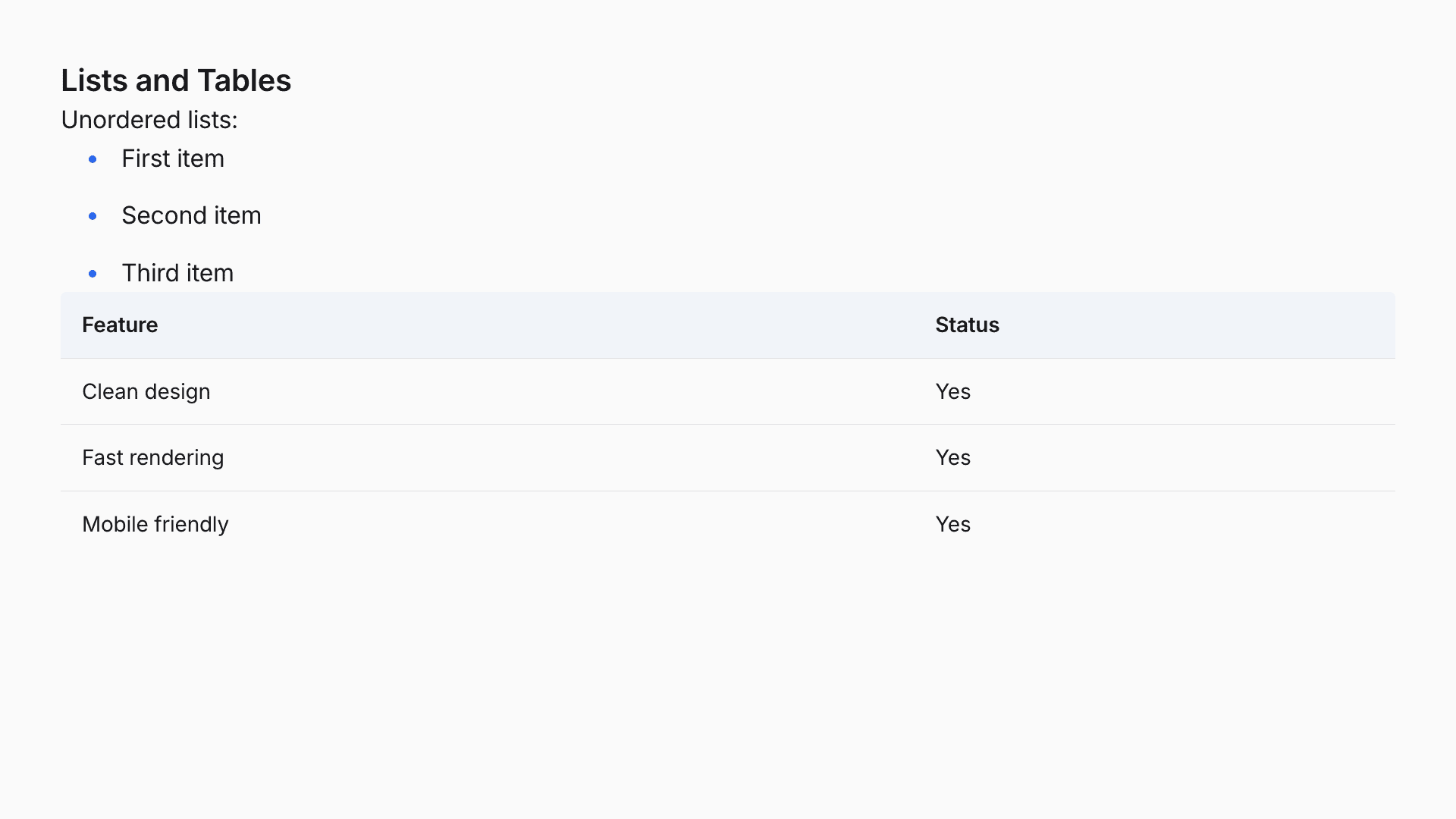
Appearance
Themes
Themes control the visual appearance of your presentation, including typography, colors, animations, and transitions. Tap comes with thirteen built-in themes designed for different presentation styles, ranging from clean professional looks to bold artistic expressions.
Setting a Theme
Set the theme in your presentation's frontmatter:
yaml
---
theme: paper
---
The theme applies to all slides in your presentation.
Built-in Themes
Paper
Ultra-clean and premium, like a fresh sheet of premium paper where content takes center stage.
yaml
---
theme: paper
---
Best for: Professional presentations, corporate settings, content-heavy slides where readability is paramount.
Characteristics:
- Pure white background with near-black text
- Inter/system-ui typography with confident letter-spacing
- Warm accent colors (#78716c)
- Dark code blocks (#1e1e1e) with excellent contrast
- Smooth 400ms ease-out transitions
Noir
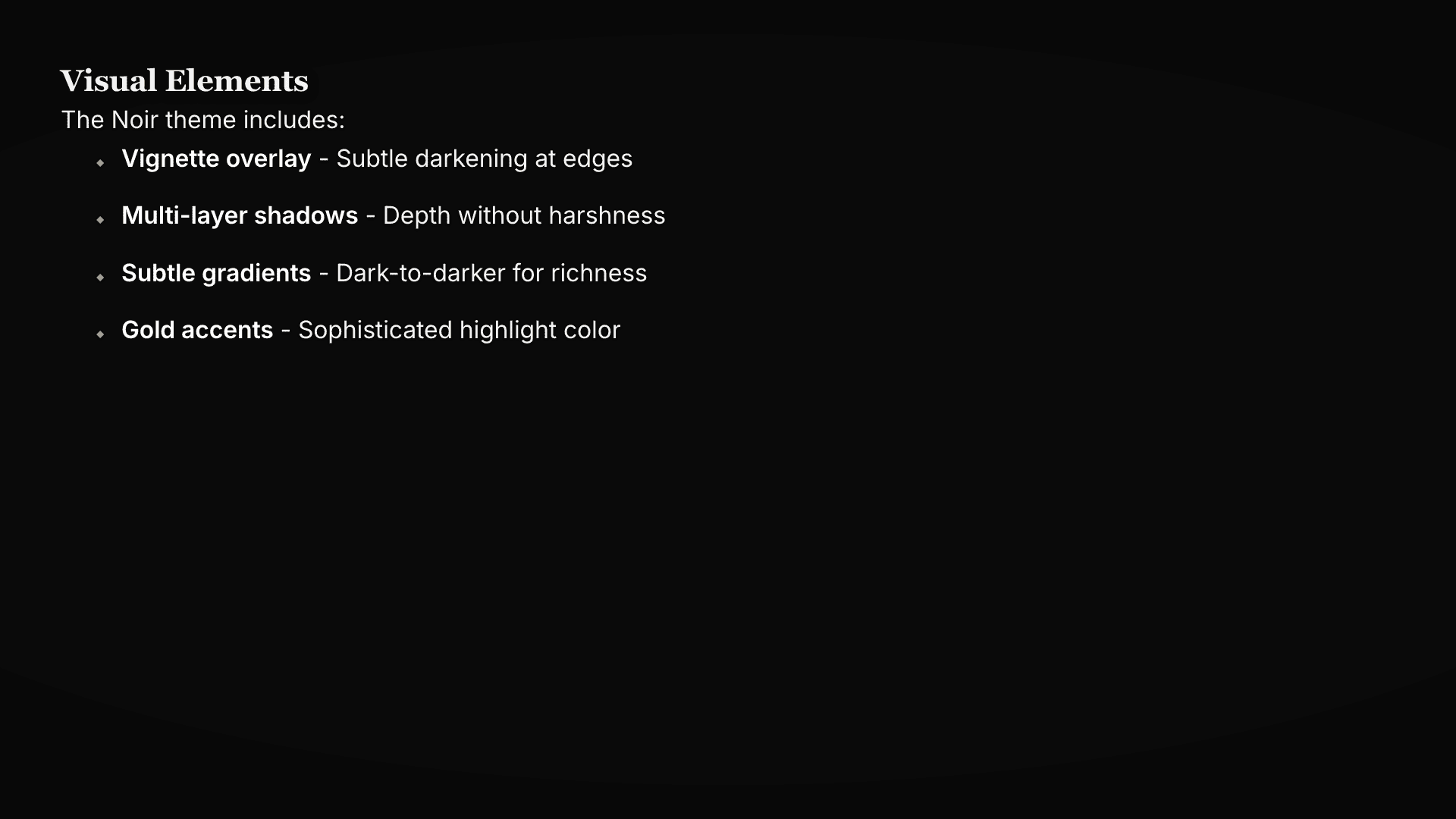
Cinematic and sophisticated, drawing from film noir elegance with deep blacks and gold accents.
yaml
---
theme: noir
---
Best for: Executive briefings, client pitches, investor meetings, premium product presentations.
Characteristics:
- Deep charcoal backgrounds (#0a0a0a)
- Crisp white text (#fafafa)
- Sophisticated gold accent (#d4af37)
- Playfair Display for headings, Inter for body
- Vignette overlay and multi-layer shadows
Aurora
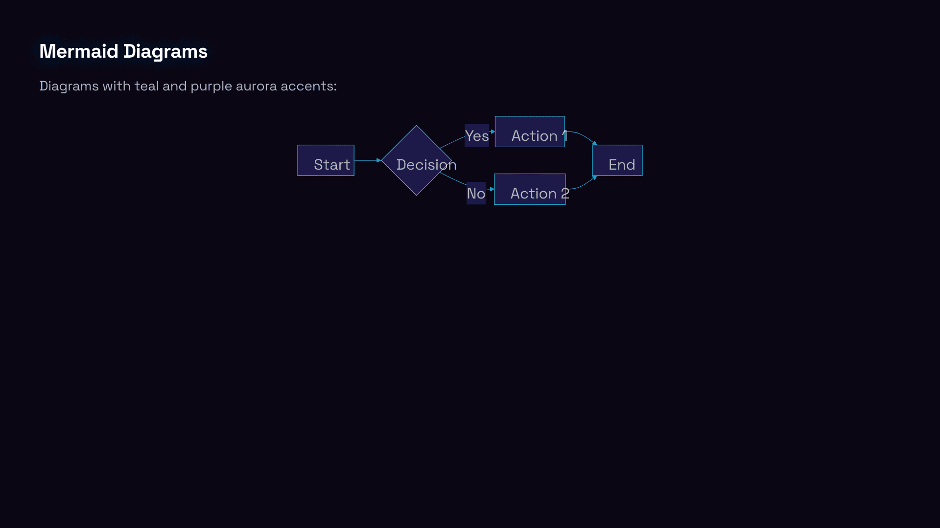
Vibrant and dynamic like the northern lights, with animated gradient mesh and glassmorphism effects.
yaml
---
theme: aurora
---
Best for: Startup pitches, creative presentations, product launches, conference talks.
Characteristics:
- Animated gradient backgrounds (purple to blue to teal)
- Glassmorphism with backdrop-blur-xl
- Space Grotesk typography
- Semi-transparent dark glass code blocks with cyan glow
- Mesmerizing 20s gradient mesh animation
Phosphor
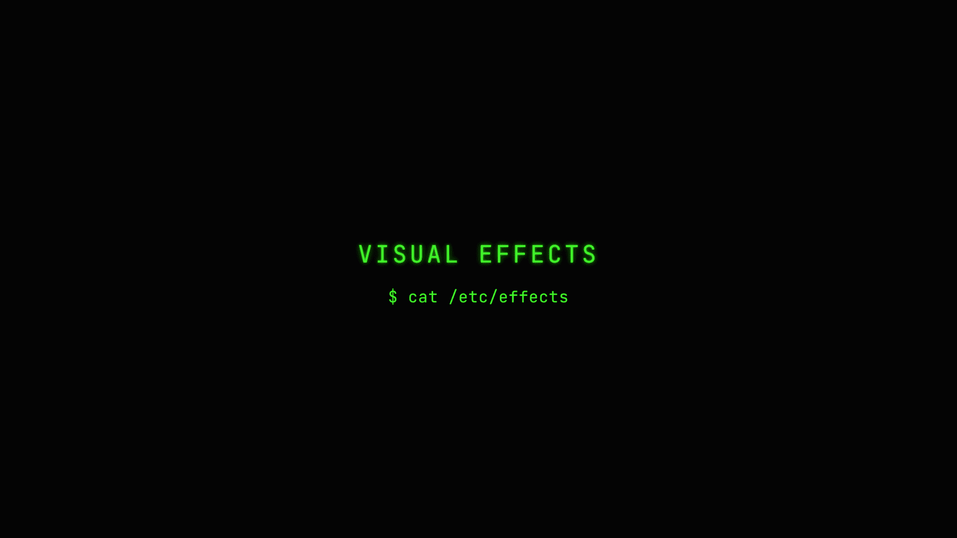
Authentic CRT monitor aesthetic with glowing phosphor green text, scanlines, and retro-futuristic hacker vibes.
yaml
---
theme: phosphor
---
Best for: Developer conferences, security talks, technical deep-dives, hacking demos.
Characteristics:
- True black (#000) background
- Phosphor green (#00ff00) primary color
- Multi-layer text shadows for glow effect
- Scanline overlay via repeating-linear-gradient
- JetBrains Mono throughout
- Screen curve vignette
Poster
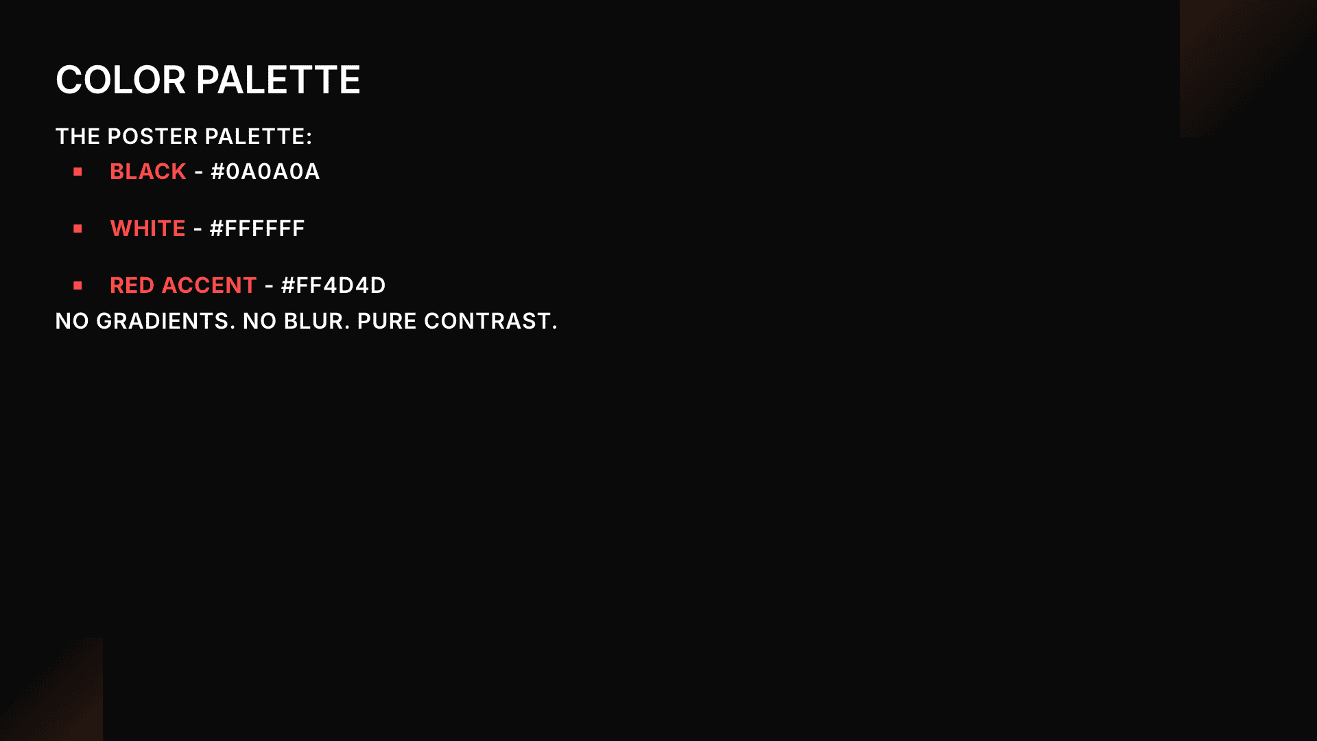
Bold graphic design with giant typography, thick borders, and high contrast that's impossible to ignore.
yaml
---
theme: poster
---
Best for: Design talks, making statements, standing out, architectural presentations.
Characteristics:
- Stark black (#000) and white (#fff)
- Electric red accent (#ef4444)
- Anton font for ALL CAPS headings
- Thick 4px borders with 8px 8px 0 drop shadows
- No rounded corners - everything sharp
- Inverted code blocks (white on black)
Ink
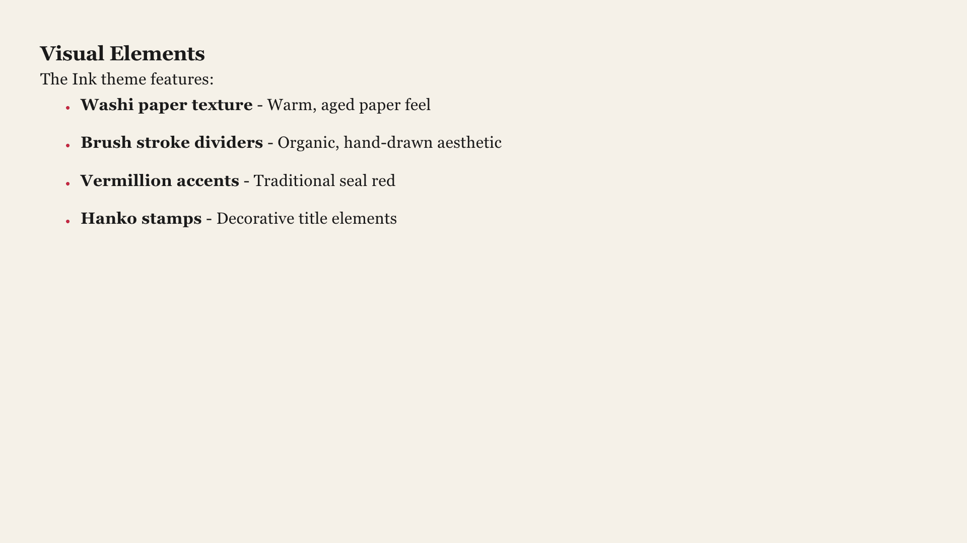
Japanese calligraphy-inspired zen minimalism with brush stroke aesthetics and washi paper texture.
yaml
---
theme: ink
---
Best for: Zen presentations, mindfulness talks, Japanese culture topics, minimalist design showcases.
Characteristics:
- Cream/off-white background (#f5f1e8) with sumi black text (#1a1a1a)
- Vermillion red accent (#c41e3a) for emphasis
- Noto Serif JP typography for elegant serif styling
- Subtle washi paper texture via CSS gradients
- Brush stroke decorative elements for blockquotes and dividers
- Hanko seal accent on title slides
Bauhaus
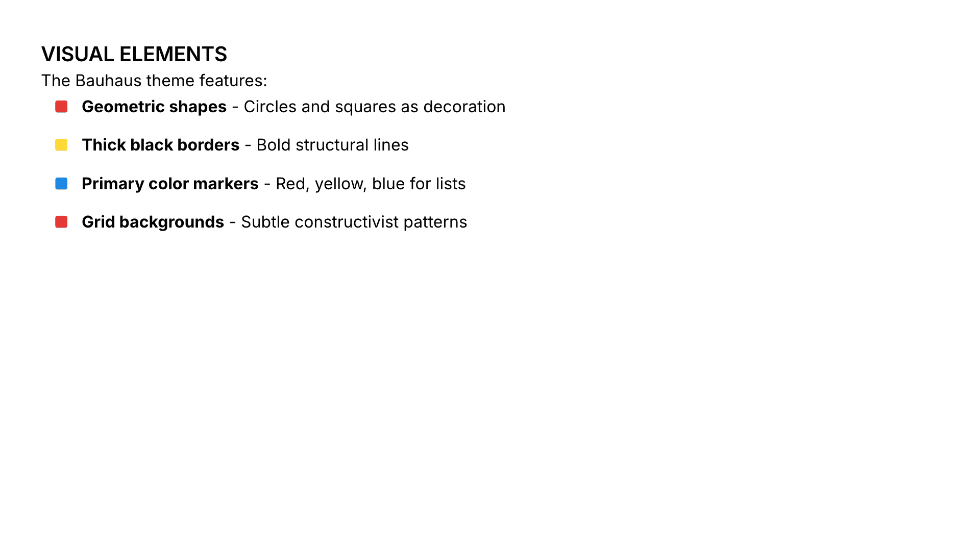
Geometric modernism with bold primary colors and constructivist design principles.
yaml
---
theme: bauhaus
---
Best for: Design school presentations, modernism discussions, architecture talks, bold statements.
Characteristics:
- Stark white background (#ffffff) with black text (#000000)
- Primary colors only: red (#e53935), yellow (#fdd835), blue (#1e88e5)
- Bebas Neue geometric sans-serif typography
- Bold geometric shapes as decorative elements
- Thick black borders with sharp corners
- Asymmetric grid-based layouts
Editorial
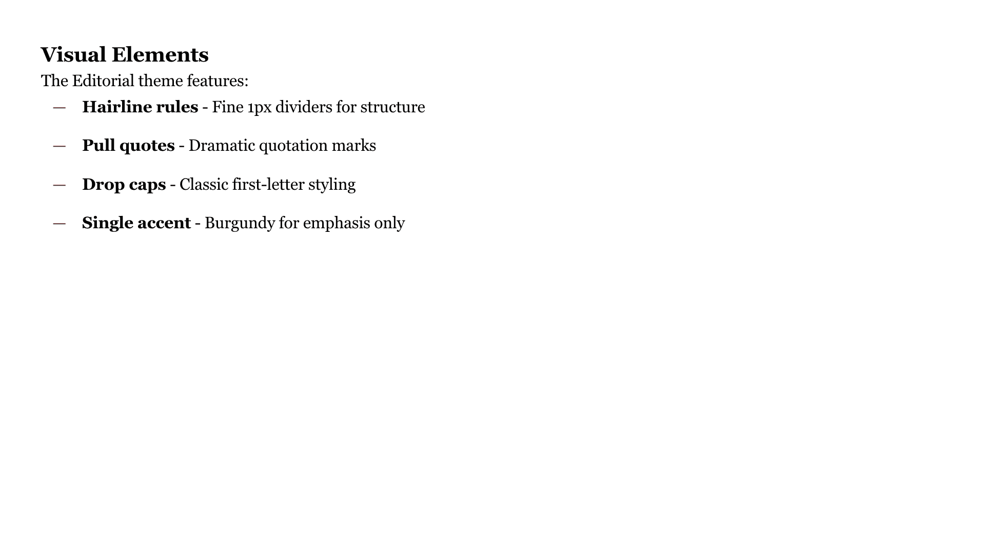
Classic magazine publishing design with elegant typography and sophisticated layout.
yaml
---
theme: editorial
---
Best for: Publishing talks, journalism presentations, content strategy, brand storytelling.
Characteristics:
- Crisp white background (#ffffff) with true black text (#000000)
- Single spot color: deep burgundy (#7f1d1d)
- Playfair Display for headlines, Source Serif Pro for body
- Drop cap styling for first paragraphs
- Fine hairline rules (1px borders)
- Large quotation marks for pull quotes
Signal

Developer-first aesthetic inspired by Vercel and Nuxt, with neon green accents and metadata-rich layouts.
yaml
---
theme: signal
---
Best for: Developer conferences, technical talks, API showcases, open-source project presentations.
Characteristics:
- Near-white background (#fafafa) with pure black text
- Neon green accent (#00dc82) for emphasis
- Instrument Sans typography throughout
- True black code blocks (#0a0a0a) with green highlights
- Hairline border list separators instead of bullets
- Tag/badge directive support for metadata display
Carbon
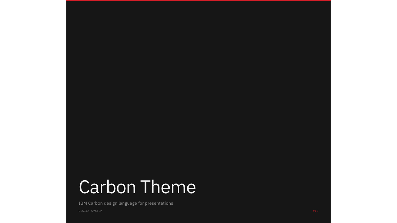
IBM Carbon design system aesthetic with sharp corners, systematic spacing, and red accent marks.
yaml
---
theme: carbon
---
Best for: Enterprise presentations, design system talks, IBM-aligned events, data-heavy slides.
Characteristics:
- Pure white background with IBM design language
- Sharp 0-radius corners throughout
- Carbon red accent (#da1e28)
- IBM Plex Sans and IBM Plex Mono typography
- Inverted title slides (dark background, red top bar)
- Numbered list items in monospace (01, 02, 03...)
Spectrum
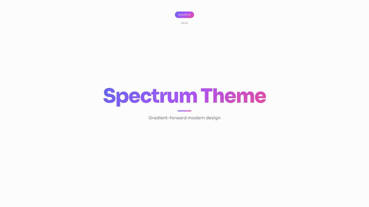
Gradient-forward modern SaaS design with indigo-to-pink spectrum accents and card-style layouts.
yaml
---
theme: spectrum
---
Best for: SaaS product launches, startup pitches, marketing presentations, modern brand talks.
Characteristics:
- Off-white background (#fcfcfd) with dark text
- Indigo-purple-pink gradient accent
- Sora geometric sans-serif typography
- Fira Code for code blocks with ligature support
- 14px rounded corners throughout
- Gradient text on title headings
- Card-style list items with gradient number badges
Mono
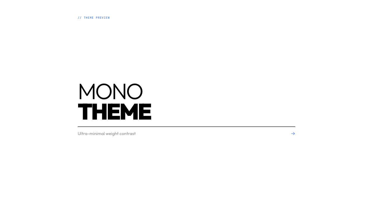
Ultra-minimal design driven entirely by typography weight contrast, from thin 300 to black 900.
yaml
---
theme: mono
---
Best for: Design talks, typography discussions, minimal presentations, academic lectures.
Characteristics:
- Pure white background with pure black text
- Single blue accent (#2563eb) used sparingly
- Outfit font with extreme weight range (300–900)
- Weight contrast as the primary design tool
- Chevron (›) list markers
- Sharp 2px radius code blocks
- Arrow (→) element on title slides
Flux
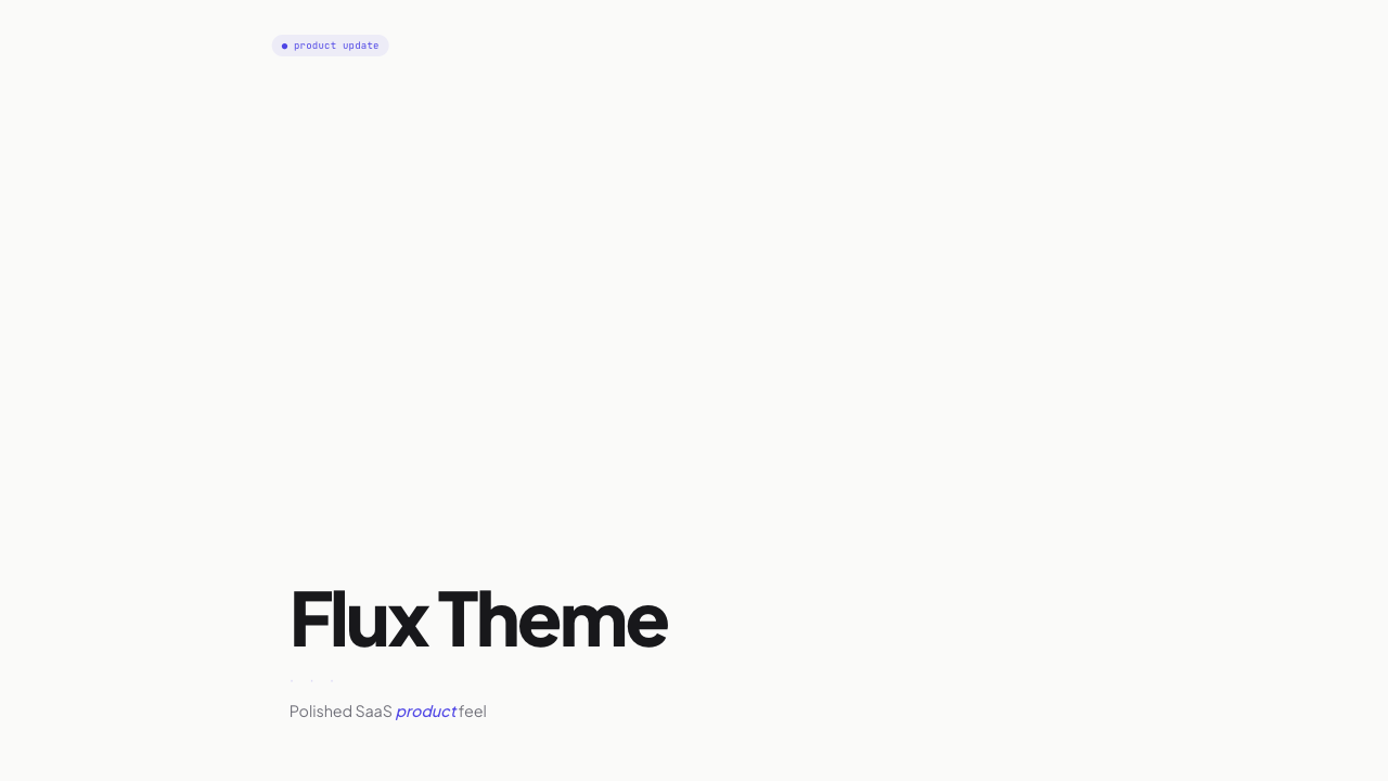
Polished SaaS product feel with warm tones, indigo accents, and interface-inspired design patterns.
yaml
---
theme: flux
---
Best for: Product demos, SaaS presentations, team updates, feature announcements.
Characteristics:
- Warm off-white background (#fafaf9)
- Indigo accent (#4f46e5) for interactive elements
- Plus Jakarta Sans with friendly character
- Filled-circle (●) bullet markers
- 12px rounded code blocks with dot-separated labels
- Chip tag badges on title slides
- Italic emphasis in accent color
What Themes Control
Each theme defines:
| Aspect | Description |
|---|---|
| Typography | Font families, sizes, weights, and line heights for headings, body text, and code |
| Colors | Background colors, text colors, accent colors, and syntax highlighting palette |
| Animations | How elements appear on slides (fade, slide, bounce, etc.) |
| Transitions | How slides transition between each other (fade, push, slide, zoom) |
| Spacing | Padding, margins, and overall layout density |
| Code styling | Code block appearance, syntax highlighting colors, and font sizing |
Theme Reference Table
| Theme | Vibe | Background | Typography |
|---|---|---|---|
paper | Ultra-clean, premium | Light (#ffffff) | Inter/system-ui |
noir | Cinematic, sophisticated | Dark (#0a0a0a) | Playfair Display + Inter |
aurora | Vibrant, dynamic | Animated gradient | Space Grotesk |
phosphor | CRT, hacker aesthetic | Black (#000) | JetBrains Mono |
poster | Bold, graphic | High contrast | Anton + system sans |
ink | Zen, calligraphy | Cream (#f5f1e8) | Noto Serif JP |
bauhaus | Geometric modernism | White (#ffffff) | Bebas Neue |
editorial | Magazine publishing | White (#ffffff) | Playfair Display + Source Serif Pro |
signal | Developer, metadata-rich | Near-white (#fafafa) | Instrument Sans |
carbon | IBM design system | White (#ffffff) | IBM Plex Sans + IBM Plex Mono |
spectrum | Gradient SaaS | Off-white (#fcfcfd) | Sora + Fira Code |
mono | Ultra-minimal typography | White (#ffffff) | Outfit |
flux | Polished SaaS product | Warm off-white (#fafaf9) | Plus Jakarta Sans |
Customizing Themes
Color Overrides
Override theme colors using themeColors in frontmatter:
yaml
---
theme: paper
themeColors:
  accent: "#ff0000"
  background: "#f5f5f5"
---
Available color keys: background, text, muted, accent, codeBg
Custom Theme CSS
For complete customization, create your own theme CSS file:
yaml
---
customTheme: "./my-theme.css"
---
Your CSS file should define these CSS custom properties:
css
.theme-custom {
  --color-bg: #ffffff;
  --color-text: #0a0a0a;
  --color-muted: #71717a;
  --color-accent: #3b82f6;
  --color-code-bg: #1e1e1e;
  --font-sans: Inter, system-ui, sans-serif;
  --font-mono: 'JetBrains Mono', monospace;
}